Wednesday, 5 June 2013

Chapter 3 Design Development - Stars


Design Development Sheet A

Based on Star Shapes

IMG_0065

Design inspiration from Chapter 1 used  to Develop Sheet A

IMG_0156

  Design Sheet A (i) Counter-change 1

I like this star shape with it’s negative space but it will be too large to use for subsequent designs.


 IMG_0184

Design Sheet A (i) Counter-change 2

This star with its negative shape is a more practical size to use for my designs

IMG_0251

Design Sheet A (i) Counter-change 3

Another interpretation of my star with its negative shape, this is very subtle and could be useful later in a fabric design

---------------------------------------------

IMG_0169

Design Sheet A (ii) – Positive and Negative. My chosen stars enclose a negative square shape. The design also illustrates interchange of colour, because the stars are alternate hues of pale and dark turquoise


---------------------------------------------------

IMG_0249

        A         B           C

Design Sheet A (iii) Symmetry and (iv) Asymmetry

(iii) My star shape A has two lines of symmetry

(iv) Two asymmetrical  arrangements B and C of the star shape

------------------------------------------------------------------------------------

IMG_0246 IMG_0248

 Design Sheet A (v) Distortion

My star shape drawn onto t-shirt material and subsequently stretched and distorted in an embroidery frame


IMG_0253

 Distortions 1 and 2

1. Original shape and distorted shape inside a diamond

IMG_0255

1. Original shape and distorted shape inside an oval

------------------------------------------------------------------------------------------


IMG_0236

Design Sheet A (vii) Repeat Pattern

My star shape inside a diamond and arranged to make an edge to edge repeat pattern.

------------------------------------------------------------------------------------

 Design Development Sheet B

Sheet B(i) Scale- using large and small versions of same star shape. (Basic shape 6x6cm)

 IMG_0239

Sheet B(ii) Scale- large and small version of same star shape used to make a repeat pattern

IMG_0238

Sheet B(iii) Scale- the larger version of my star shape making a border around two sides of the repeat pattern above.

I feel this design is too ‘busy’ there is not enough background showing to give contrast and emphasise the design. I don’t think the complimentary colours work.

   -----------------------------------------------------------------------------------------                                                           

IMG_0240

           A         B           C

Sheet B (iv) Linking Border  (v) Linking two different star shapes

(Basic shape 8x8cm)

(iv) A + C Negative star shapes linked in two different ways

(v) B – Negative as well as a  positive shape linked

----------------------------------------------------------------------------------

IMG_0243

A         B        C        D

Sheet B(vi) New shapes from old

A – Original shape (8x8cm)

B, C, D New shapes made from cutting up original and rearranging cut pieces.

I think design C  would  work well in a cut and layered  fabric sample, I like the bronze with the two turquoise hues.

.-------------------------------------------------------------------------------------

 Design Development Sheet C

IMG_0380

Design inspiration from Chapter 1 used  to Develop Sheet C

IMG_0211

Sheet C(i) Star shape with complex counter change design

------------------------------------------------------------------------------------------------------------

 IMG_0187

A                  B             C       

Sheet C(i)  - (A) Basic star shape (B) Star cut into quarters and shown with alternate colours and (C) Colours in opposite spaces

(Basic star shape 12x12cm )

---------------------------------------------------------------------------------------

IMG_0231


Sheet C(ii)  Divide and separate, chosen unit of the star (bottom left side)  used to make a new design

-----------------------------------------------------------------------------------------------------------

C(iii)  More patterns with chosen design unit

IMG_0212 IMG_0221

A – Repeat pattern              B – Symmetrical pattern


IMG_0218 IMG_0217

c – An overlap pattern          D– An interlocking pattern

Both the above give the impression of solid shapes

IMG_0215  IMG_0223

E – A random  pattern    F – Simple symmetrical star 

    IMG_0229 IMG_0225

G +  H – Complex symmetrical patterns with interesting negative shapes

I found this exercise fascinating, I was able to make so many designs from one unit. The above are just my favourite samples. I decided to display these designs on a plain background because the subtle bronze/turquoise colours of the units did not display well on a patterned background.

 I tried this exercise again and explored a different star shape, the results are below.  

----------------------------------------------------------------------------------------------------

Another interpretation of Sheet C

  IMG_0202

        A                                 B                               

C(i) Basic star shape (B)  +  Star cut into quarters (A)

( Basic shape 10x10cm )


Sheet C(iii) Units of the star shape used to make new designs

IMG_0203IMG_0199

   A                                            B

     A + B Patterns with wonderful negative spaces

 IMG_0197 IMG_0198

   C – Repeat pattern              D – Overlap pattern

IMG_0200  IMG_0206

E  - Pattern with ‘movement’     F – Opposing movement

IMG_0204 IMG_0205

G – Random pattern                H – Interlocking pattern

IMG_0194

I - Complex Star shape with counter change

Several of these patterns have a very Art Deco feel.

‘A’ could possibly make a good frame for a bonded and/or embroidered  fabric sample

I enjoyed this chapter it showed me how it it possible to develop a simple element of a design into many interesting and more complex designs


Monday, 13 May 2013

Chapter 1 Research on Stars

Hello Sian,

thank you for your constructive and helpful feed back on my posts for Chapters 1 and 2. I have revised my work on Chapter 1 following your tips and advice.  It is included below. I  added some extra material  as well as including notes and numbers for the images. I am progressing with Chapter 3 and will include some information on Health and Safety issues as well as photos of my self at work next time I post. I was a primary school teacher for many years so realise that a safe working environment is important. However I feel , as you said, that much of it is just common sense! I am lucky to have a dedicated ‘work station’ it does not have to be packed away and  is not in a kitchen. There is a picture of my work place below.  I already have several design ideas inspired by my research images. I am developing these in my head and on my pin board. (I managed to find space for one!) I have been looking around for suitable plain fabrics here but have not had much luck.  I found some white, pure cotton, Portuguese tea towels that I could dye/print etc but I need more variety. Can you recommend any good web sites for fabric?

I would still be happy to come to the summer school  at short notice. Many thanks again.  Regards Lorna


IMG_0183


Module 1 . Shape and Colour

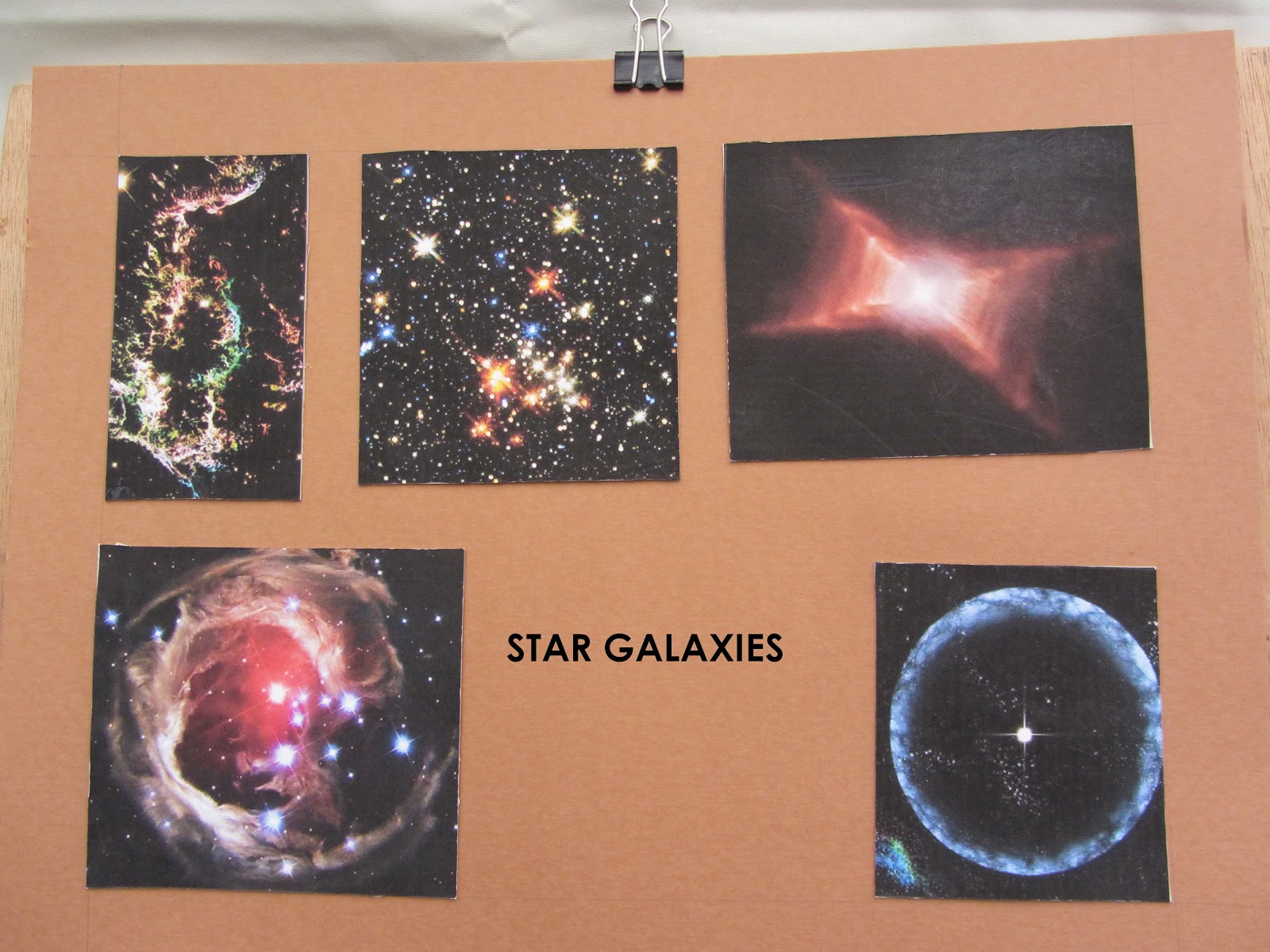
Inspirational phrases – stars in your eyes – star quality – star struck – star gazing – morning star – shooting star – galaxy of stars


Inspirational  Images


IMG_0054

 Image 1 a

These images of galaxies were taken by  the Hubble telescope. They are amazing.

------------------------------------------


IMG_0059

Image 1 b

These images of  tile patterns were taken from several sources. The top line were inspired by the ‘Arts and Craft ‘ movement. The middle tile is a traditional Portuguese design and the bottom images are of tile patterns from the Alhambra in Grenada.

-----------------------------------


IMG_0063 IMG_0061

Image 1 c and d

These images of star fish were taken from the National Geographic’ magazine library. They are so colourful and inspirational.


-----------------------------------------


IMG_0064 IMG_0065

Image 1 e

 These images are of traditional patchwork blocks. I love patchwork and they come from my own collection of books and designs. 

-----------------------------------------


IMG_0050

Image 1 f

This  image is of a patchwork quilt I made recently. It is my serendipity quilt because it was finished just before I decided to start this course and  had no idea about the ‘star’ theme.

--------------------------------------


IMG_0076 

Image 1 g

These images are of crochet motifs. Crochet is another of my passions. Designs can be very  traditional as in these motifs or  more modern and free form.

-------------------------------------------


 IMG_0149

Image 1 h

An appliqué star made from scraps of patchwork fabric

------------------------------------------


IMG_0134

Image 1 i

This image was made using broken pieces of scallop shell collected on a nearby beach. The ribbed pattern gives a lovely surface texture.

----------------------------------------

IMG_0174

Image 1 j

A random collection of umbrella pine needles that I noticed on the ground when out for a walk. I can see a distorted star shape and I feel it has the look of a star galaxy with radiating spikes of light.

Colour Wheels

These colour wheels were painted with water colours because I already own lots them and I will need to use them for the coloured papers in Chapter 2. The recommended inks are not available in Portugal.

Image 1 k

 IMG_0151

The hues are intense with lots of pigment added to a little water.

----------------------------------


Image 1 l

IMG_0153


Image 1

The tints were painted using the traditional water colour method of adding more water to the original hue and allowing the white background to show through. Adding white paint would make the tint dull and opaque.

--------------------------------------------


Image 1 n

IMG_0154

The shades were painted by adding black to the original hues. The changes are amazing, they appear very different from the original hues.

Sunday, 5 May 2013

Chapter 2 –Making Coloured Papers

Distant Stitch - Embroidery Certificate Level 3

Module One

Chapter 2 - Making Coloured Papers

I used water colours for my coloured papers because the recommended inks were not available in Portugal where I live for much of the year. Water colours have special qualities, the intensity of a hue is directly influenced by the amount of water used when mixing. Traditionally white is not used to obtain a tint because white makes the hue dull and opaque. Instead more water is added to increase transparency, this allows the white background paper to show through. It is possible to make intense, vibrant washes and soft, subtle washes just by varying the water content. Wetting the paper before adding the wash will  make an even more interesting effect. I initially chose the complimentary hues of a red – green and blue - orange because I feel these will work well with the images of star galaxies and starfish from Chapter 1. I found those images inspirational.


Chapter 2 - Making Coloured Papers 

IMG_0093

Image (2) a /1

These photos show a selection of the coloured papers I made before printing with star inspired shapes. I really enjoyed making these papers and experimenting with different techniques! The hues were washed on with a wide brush onto dry or wet paper, daubed on with a sponge or rolled on with a patterned sponge roller.


 IMG_0102

Image (2) a/2

This photo shows my experiments with colour mixing to obtain the hues I wanted and tests prints with various stamps. I used a rubber, make-up sponges cut to diamond or triangle shapes and a kitchen type sponge cut into star fish shapes


Chapter 2 - Making Coloured Papers 

IMG_0105

Image (2) b

These samples are intense water colour washes of my chosen complimentary hues. They were made with a wide hake wash brush on dry paper. I like the vibrancy of these washes.

-------------------------------------------------

IMG_0107

Image (2) c

This time my background washes were applied using a sponge, this makes them more subtle and transparent. The complimentary colour was daubed on with the edge of the same sponge. I like the way the background hue shows through the applied sponged print.

------------------------------------------------

IMG_0110

Image (2) d

These split-complimentary hue washes were brushed onto a dry background . The printed samples were daubed  with a sponge. The background washes are intense here. I feel the warm orange background with green printing is more successful.

--------------------------------------------------

IMG_0113

Image (2) e

Again these split-complimentary hues have been brushed onto a dry background then daubed with a sponge print. I feel the warm red background with blue printing is more successful.

-------------------------------------------------

IMG_0115 

Images (2) f

The analogous hues of blue and blue/green were washed onto wet paper and then printed with acrylic paint prints.

------------------------------------------

IMG_0118

Images (2) g

A water colour wash sponged onto dry paper with acrylic paint prints of starfish. I used the analogous hues of blue and blue/green.

----------------------------------------

IMG_0129

Images (2) h

Water colour sponged washes with acrylic prints using rubbers and sponges

-------------------------------------------------- 

IMG_0121

Image (2) i

Watercolour washes  brushed onto wet paper with acrylic paint sponge prints. I used the analogous hues of orange and red/orange.

-----------------------------------------

IMG_0124

Image (2) j

The water colour background  was sponged onto dry paper, the overprinted  starfish are also water colour. These prints are more transparent than acrylic prints. I like this effect.

  ------------------------------------------------

IMG_0127

Image (2) k

The hues here are split complimentary, the background red/orange was rolled on with a sponge roller. The ‘pinwheels’ were stamped with acrylic paint in blues and blue/greens.

---------------------------------------------------

IMG_0119

Image (2) l

The hues here are split complimentary again, the background blue/green was rolled on with a sponge roller. The ‘pinwheels’ were stamped with acrylic paint in orange/reds and the diamonds with a pale bronzed orange.


Chapter 2 - Star Shapes Cut From Coloured Papers

IMG_0137

Image (2) m 

A vibrant watercolour wash brushed onto dry paper. The star shapes were cut with a craft knife or scissors.

-------------------------------------------------

IMG_0139

Image (2) n

A subtle watercolour wash brushed onto wet paper. The  star shapes were cut with a craft knife or scissors. The maroon hue was an experimental mix of  my comlimentary colours red and green


Saturday, 20 April 2013

A little about myself and my interest in embroidery

Hello Sian,
Firstly a little about myself. I am a retired primary school teacher. When I trained as a teacher in the 1970's you could choose a subject for your personal development. I chose Textiles,Design and Dress. I really enjoyed the course and have always meant to follow up on this interest, but life , work and two children intervened! I have sewn and enjoyed doing embroidery, patchwork, applique, quilting and crochet over the years since college but now I have the time to take my interest further. At the moment I am in Portugal, my husband and I spend the winter here in our mobile home. We consider ourselves very lucky but it has caused some challenges in starting the course, some things are not so easily available as the UK. For instance I have ordered a scanner and am still waiting for it to arrive! and I have beeen unable to get any inks for the coloured papers. So I have used water colours insead doing wet washes, wet in wet washes. This has worked quite well and I have used acrylic paints for the printing.
I am including some draft work sheets for Chapter One.  They are on A4 card and I have photographed them initially,until the new scanner arrives, I would appreciate some feedback on my work to date. I consider them a work in progress! and I have copies of everything so changes and additions are not a problem. Please could you advise on background colour, number of images per sheet, groupings and anything else you feel is important. The quilt is one I made. Look forward to hearing from you. Regards Lorna.