Distant Stitch - Embroidery Certificate Level 3
Module One
Chapter 2 - Making Coloured Papers
I used water colours for my coloured papers because the recommended inks were not available in Portugal where I live for much of the year. Water colours have special qualities, the intensity of a hue is directly influenced by the amount of water used when mixing. Traditionally white is not used to obtain a tint because white makes the hue dull and opaque. Instead more water is added to increase transparency, this allows the white background paper to show through. It is possible to make intense, vibrant washes and soft, subtle washes just by varying the water content. Wetting the paper before adding the wash will make an even more interesting effect. I initially chose the complimentary hues of a red – green and blue - orange because I feel these will work well with the images of star galaxies and starfish from Chapter 1. I found those images inspirational.
Chapter 2 - Making Coloured Papers
Image (2) a /1
These photos show a selection of the coloured papers I made before printing with star inspired shapes. I really enjoyed making these papers and experimenting with different techniques! The hues were washed on with a wide brush onto dry or wet paper, daubed on with a sponge or rolled on with a patterned sponge roller.
Image (2) a/2
This photo shows my experiments with colour mixing to obtain the hues I wanted and tests prints with various stamps. I used a rubber, make-up sponges cut to diamond or triangle shapes and a kitchen type sponge cut into star fish shapes
Chapter 2 - Making Coloured Papers
Image (2) b
These samples are intense water colour washes of my chosen complimentary hues. They were made with a wide hake wash brush on dry paper. I like the vibrancy of these washes.
-------------------------------------------------
Image (2) c
This time my background washes were applied using a sponge, this makes them more subtle and transparent. The complimentary colour was daubed on with the edge of the same sponge. I like the way the background hue shows through the applied sponged print.
------------------------------------------------
Image (2) d
These split-complimentary hue washes were brushed onto a dry background . The printed samples were daubed with a sponge. The background washes are intense here. I feel the warm orange background with green printing is more successful.
--------------------------------------------------
Image (2) e
Again these split-complimentary hues have been brushed onto a dry background then daubed with a sponge print. I feel the warm red background with blue printing is more successful.
-------------------------------------------------
Images (2) f
The analogous hues of blue and blue/green were washed onto wet paper and then printed with acrylic paint prints.
------------------------------------------
Images (2) g
A water colour wash sponged onto dry paper with acrylic paint prints of starfish. I used the analogous hues of blue and blue/green.
----------------------------------------
Images (2) h
Water colour sponged washes with acrylic prints using rubbers and sponges
--------------------------------------------------
Image (2) i
Watercolour washes brushed onto wet paper with acrylic paint sponge prints. I used the analogous hues of orange and red/orange.
-----------------------------------------

Image (2) j
The water colour background was sponged onto dry paper, the overprinted starfish are also water colour. These prints are more transparent than acrylic prints. I like this effect.
------------------------------------------------
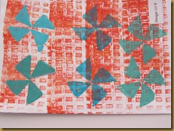
Image (2) k
The hues here are split complimentary, the background red/orange was rolled on with a sponge roller. The ‘pinwheels’ were stamped with acrylic paint in blues and blue/greens.
---------------------------------------------------
Image (2) l
The hues here are split complimentary again, the background blue/green was rolled on with a sponge roller. The ‘pinwheels’ were stamped with acrylic paint in orange/reds and the diamonds with a pale bronzed orange.
Chapter 2 - Star Shapes Cut From Coloured Papers
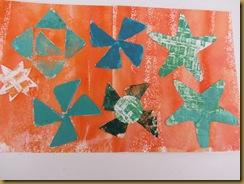
Image (2) m
A vibrant watercolour wash brushed onto dry paper. The star shapes were cut with a craft knife or scissors.
-------------------------------------------------
Image (2) n
A subtle watercolour wash brushed onto wet paper. The star shapes were cut with a craft knife or scissors. The maroon hue was an experimental mix of my comlimentary colours red and green


No comments:
Post a Comment